 how-to
How to Choose a Color Palette for Your Wardrobe
Table of Contents
- Start With a Wardrobe Audit
- Determine Your Skin Tone and Undertone
- How to Find Your Clothing Color Palette
- Build a Capsule Wardrobe Color Palette
- Wardrobe Color Palette Examples for Different Lifestyles
- How to Coordinate Clothing Colors for Maximum Versatility
- Test Your Palette and Refine Over Time
- Frequently Asked Questions
Last Updated: October 19, 2026
Start With a Wardrobe Audit
Before you build a wardrobe color palette, look at what you already own. This is the foundation for how to choose a color palette for your wardrobe that works with your life, and it is the step most guides skip.
Lay everything from your closet out by color group on a bed or table. You'll spot patterns immediately: which colors you reach for, which pieces work together, and which sit unworn.
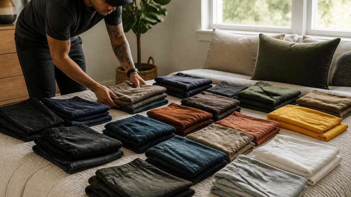
Run the audit in four passes
Pass 1, Sort by color family, not garment type. Make piles for black, white/cream, gray, brown/tan, blue, green, red/pink, yellow/orange, and pattern.
Pass 2, Count, don't guess. Tally how many pieces you have in each color family.
Pass 3, Flag wear and fit. For each piece ask: Does it fit right now? Is it in wearable condition? Have I worn it in the last 12 months?
Pass 4, Mark the connectors. A connector is any piece that already works with at least three other items.
As you go, note which colors appear most, which pieces get worn constantly, which never leave the closet, and which colors you own but never combine.
What the audit tells you before you buy anything
The audit answers one question: what should I add, and what should I stop buying? If your connectors cluster in cool neutrals, a warm accent will fight them; if they're all tops, your gap is bottoms. Write one sentence before you close the closet, for example, "My base is navy and cream; my gap is a warm accent and one pair of neutral bottoms", and use it as your shopping filter.
Determine Your Skin Tone and Undertone
Your skin tone and undertone anchor a wardrobe color palette that flatters you. Skin tone is how light or dark your skin is; undertone is the subtle hue beneath the surface, warm, cool, or neutral.
Find your undertone with a simple test: under natural light, veins that look greenish suggest warm undertones, blue or purple indicate cool, and both equally means neutral.
Warm undertones pair well with earthy colors: warm browns, golden yellows, rust, olive green, and warm reds. Cool undertones look best in jewel tones, icy blues, silvers, and berry shades. Neutral undertones can wear almost any color, you have flexibility.
How to Find Your Clothing Color Palette
A clothing color palette is a curated set of colors that work together and flatter your natural coloring. Here is how to choose a color palette for your wardrobe that feels cohesive and functional. Start with three layers: base, accent, and neutral colors.
Base colors are your foundation, the shades you wear most, and should align with your undertone: warm types choose caramel, warm gray, or soft brown; cool types pick navy, cool gray, or soft taupe. Accent colors add personality, pick 2-4 you love that complement your base shades. Neutral colors anchor everything: black, white, cream, gray, and brown work across most palettes, so choose warm neutrals for warm skin and cool neutrals for cool skin.
Warm, Cool, and Neutral Palettes Explained
A warm color palette features golden, earthy, peachy tones, terracotta, mustard, warm bronze, olive, rust, with yellow or orange undertones, and feels grounded and natural. A cool color palette uses jewel tones, icy shades, and silvers, navy, emerald, lavender, icy pink, cool gray, with blue or purple undertones, and feels sophisticated and crisp. A neutral palette blends warm and cool equally: beige, soft gray, cream, and muted colors offer maximum flexibility for adding accents as mood dictates.
Build a Capsule Wardrobe Color Palette
A capsule wardrobe color palette is a small collection of versatile pieces in coordinated colors, so everything mixes and matches easily. Start with 5-7 base pieces: two neutral tops (cream, soft gray), two base-color bottoms (navy, caramel), one layering piece (cardigan, blazer), and one neutral jacket. Add 3-4 accent pieces, a jewel-tone sweater, an accent blouse, patterned pieces that tie the palette together. If your base is navy and warm gray, add rust, mustard, or olive. Every piece should work with at least three others.
Wardrobe Color Palette Examples for Different Lifestyles
Your lifestyle shapes which colors work best. An office worker needs different color logic than a remote worker or weekend adventurer.
Active Professionals and Commuters
If you commute to an office daily, build around neutral bases: navy, charcoal, cream, or soft gray. Add professional-but-interesting accents, burgundy, forest green, deep teal, or warm brown, that work in meetings and on video calls. Include one statement piece, like a jewel-tone blazer or sweater, and avoid very bright or trendy shades that feel out of place professionally.
Outdoor Adventurers and Weekend Warriors
Outdoor-focused wardrobes need colors that work in nature and the city. Start with earth tones, olive, warm brown, rust, warm gray, and add nature-inspired accents like forest green, slate blue, burnt orange, or charcoal. Darker, muted shades hide dirt and wear well; avoid very light colors that stain easily.
Look for pieces in performance fabrics that come in your palette colors. Tremendous World offers premium athletic lifestyle apparel designed for both mountain trails and city streets, giving you pieces that work across both environments.
Remote Workers and Flexible Schedules
Remote workers can embrace comfort without sacrificing style, with a more personal, expressive palette. Choose colors that feel good emotionally, warm if they energize you, cool if they calm you. Include cozy textures and softer colors like cream, soft taupe, warm beige, sage green, or muted blue, plus accents you genuinely love. Since you're home most days, pick soft, breathable fabrics. Tremendous World's streetwear collection includes pieces designed for comfortable home offices and casual city outings, bridging that gap between work-from-home comfort and weekend social plans.
How to Coordinate Clothing Colors for Maximum Versatility
Once you've chosen your palette, coordination makes everything work together, maximizing outfit options and simplifying getting dressed. The goal is a small set of repeatable combinations so you stop making color decisions in the morning.
Use contrast, not just color count
The popular "three-color rule" is really a contrast rule in disguise: what makes an outfit cohesive is the relationship between light and dark, not the number of hues. A navy top, cream bottom, and rust accessory feels balanced because it has one dark, one light, and one mid-tone accent. Navy, cream, rust, and green feels chaotic not because there are four colors but because two compete for the same visual weight.
A more reliable working rule: one dark, one light, one accent. If you want a fourth element, make it a texture or a pattern in a color you already have, not a new hue. That keeps the palette intact while adding interest.
Build outfit formulas you can repeat
Pair base colors with base colors, navy bottoms with cream tops, warm gray bottoms with caramel tops. Add one accent per outfit: a rust scarf on navy and cream, an olive cardigan on warm gray and caramel. Use neutrals to bridge color families so warm and cool pieces can both work.
Concrete formulas to test in your own closet:
- Base bottom + base top + neutral accessory (the default uniform)
- Base bottom + accent top + neutral accessory (the personality outfit)
- Neutral bottom + base top + accent accessory (the safe experiment)
- Base bottom + base top + patterned piece in palette colors (the texture play)
Test these formulas in your actual wardrobe. You'll quickly see which combinations work, and which ones only look good on a hanger.
Check color under real light before you commit
Screens and store lighting distort color: a sweater that looks warm camel on your phone can read cool taupe in daylight. Two habits fix most of this:
- Compare in daylight. Hold the new piece next to what you'll wear it with at a window or outside; fluorescent and LED lighting shifts warm and cool tones noticeably.
- Photograph the pairing, not the item. A photo of the new piece next to your actual base pieces tells you whether it belongs. Keep those in one album for future purchases.
If you shop online, order from retailers with free returns and treat the first try-on as a color test, not a fit test.
Coordinate without relying on color alone
Not everyone perceives color the same way, and poor lighting throws anyone off. Contrast, texture, and pattern let you build outfits without depending on hue matching:
- Contrast does the heavy lifting: a dark bottom and light top reads as intentional even if the hues are close.
- Texture separates pieces in similar colors, smooth knit against ribbed, matte against sheen.
- Pattern in palette colors ties a look together and reduces the need for a perfectly matched accent.
This also makes your palette forgiving: if two pieces are slightly off in tone, contrast and texture cover the difference.
Tie coordination back to shopping
Coordination is a shopping filter, not just a dressing skill. Before buying, ask: does this piece work with at least three items I already own, in daylight, using one of my formulas? If not, it's a one-off, and one-offs break capsule systems. Prioritize pieces that fill a formula gap (a missing neutral bottom, a second accent that bridges two bases) over duplicates of colors you already own in abundance.
Test Your Palette and Refine Over Time
Your first palette won't be perfect; testing and refinement make it work. Wear it for two weeks and notice which combinations feel natural, which pieces you reach for repeatedly, and which colors make you feel confident.
Building a wardrobe color palette takes intention, but the payoff is real: getting dressed becomes faster, outfits look more cohesive, and you actually wear what you own.
At Tremendous World, we design premium athletic lifestyle apparel so your pieces work whether you're heading to the office, hitting the trail, or transitioning between both. Our streetwear collection is built for people who move between environments, with colors and quality that make coordination effortless.
Frequently Asked Questions
How do I choose a color palette for my wardrobe if I have different skin tones in my family?
Each person should identify their own skin tone and undertone separately, as color harmony is individual. A warm undertone person and a cool undertone person in the same household will have different flattering palettes. Start by analyzing each person's natural coloring independently, then build separate capsule wardrobes or choose overlapping neutral colors (like black, gray, or white) that work for everyone when shared pieces are needed.
What colors should I include in a capsule wardrobe color palette?
Start with 2-3 neutral base colors (black, gray, white, beige, or navy), then add 2-3 accent colors that complement your skin tone. For warm undertones, consider warm neutrals and golden or bronze tones; for cool undertones, try cool neutrals and jewel tones. Include one versatile color that bridges your existing wardrobe and new pieces. This combination allows you to mix and match outfits without buying excessive pieces.
How many colors should a wardrobe color palette have?
Most effective capsule palettes contain 5-7 colors total: 2-3 neutrals as your base, 2-3 accent colors, and 1-2 bridge colors that coordinate with existing pieces. This range provides enough variety for outfit combinations without overwhelming your closet. Too few colors limits mix-and-match potential; too many dilutes the coordinated effect and makes planning outfits harder.
Can I use seasonal color analysis to build my wardrobe palette?
Yes. Seasonal color analysis identifies which color families (warm, cool, bright, or muted) flatter your natural coloring based on your skin tone, hair color, and eye color. Once you know your color season, you can confidently choose accent colors and neutrals that harmonize with your appearance. This approach simplifies shopping and ensures every piece in your wardrobe complements your natural coloring, making outfit coordination faster and more effective.